Moovit: Inclusive Transit Companion for the Visually Impaired
How do blind people navigate chaotic public transit when 80% of city wayfinding relies on sight? An end-to-end accessibility ecosystem combining real-time acoustic telemetry, streamlined push notifications, and tactile physical bus stop infrastructure.
Lead UX Researcher, Service & UI Designer
Miquido Studio × Moovit × UX Bats
Wizard of Oz Testing, Field Ethnography, Tactile Prototyping
WCAG 2.1 AAA & Screen Reader Parity
In-depth qualitative interviews
Live transit stop field tests
Commuter safety confidence rating
Screen reader voice optimization
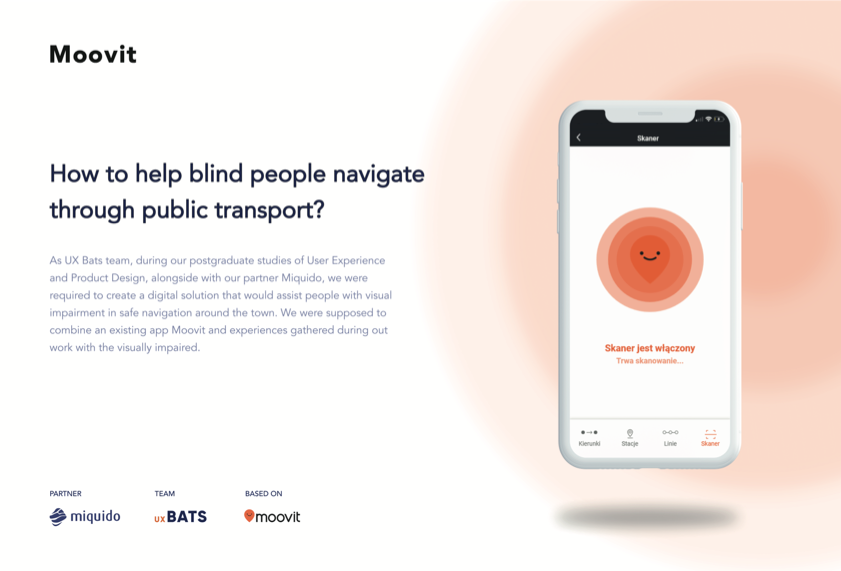
Figure 1.0 — Moovit accessible scanner companion & tactile Safe Zone concept overview
Navigating an urban jungle with zero visual cues.
Through vision, humans absorb over 80% of information about their surroundings. When entering public transport, visual cues dominate every micro-action: checking electronic departure boards, reading bus line numbers on windshields, identifying which vehicle pulled up behind another, and locating the door buttons.
While the app market offers various assistive tools, most fail in the real world due to three critical gaps:
Our team at UX Bats, in collaboration with Miquido, was challenged to design a practical, production-viable solution that truly respects the daily autonomy of blind commuters in Polish cities like Kraków.
25 hours of listening instead of assuming.
We conducted over 25 hours of direct, one-on-one interviews with blind commuters in Kraków. The research immediately shattered several tech-optimist assumptions:
“I don’t want another new app! For me, my eyes are replaced by two things: other people or my smartphone.”
— Kraków commuter, blind since birth
“When I feel the raised tactile dots under my boots, I know I’m right at the edge of the street.”
— Daily tram commuter
The 3 Structural Bottlenecks Identified
-
A.
Vehicle Number Recognition: Blind commuters feel uncomfortable constantly asking strangers for help, especially in rain or late evenings when platforms are empty.
-
B.
The "Double Stop" (Podwójny przystanek): When two buses pull into a platform simultaneously, a blind person cannot determine if their bus is parked second in line. The second bus routinely leaves before they can find the door.
-
C.
Non-Unique Stop Identifiers: In Kraków, massive transfer hubs have up to 10 distinct boarding islands all bearing the identical name "Rondo Mogilskie".
Killing our first three product ideas.
Through User Journey Mapping and Value Proposition Canvases, we initially considered three product concepts. Every single one had to be killed after testing against ground constraints:
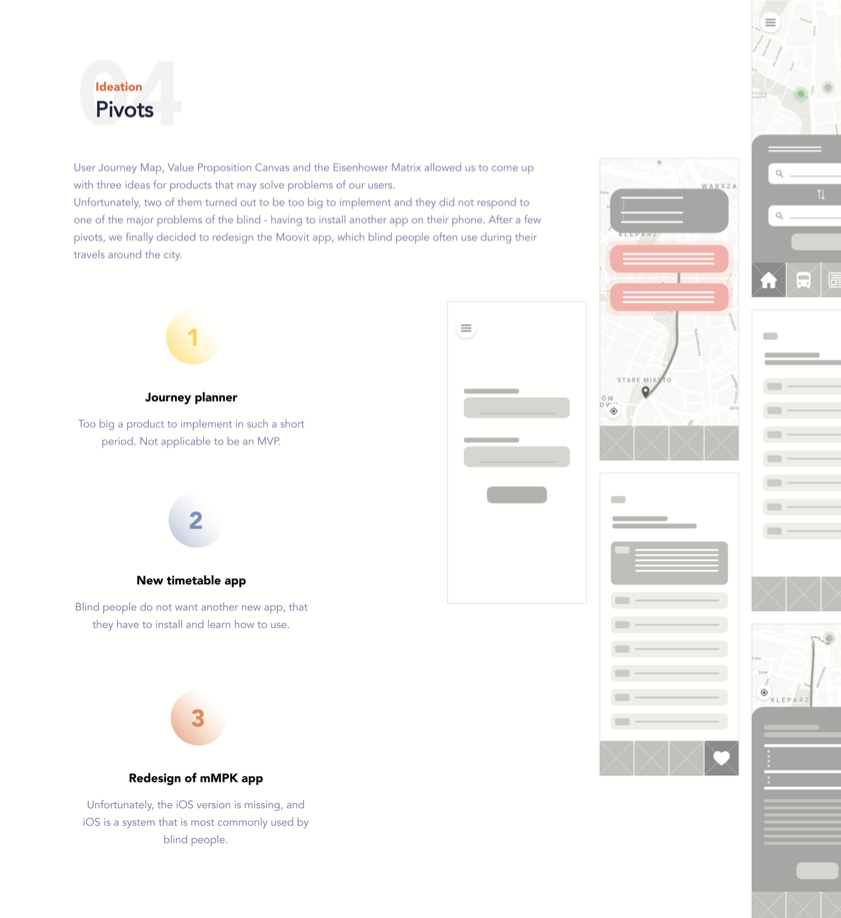
Figure 2.0 — Product evaluation matrix and discarded hypotheses
- 1. Brand New Journey Planner App ➔ REJECTED Too complex to develop as an MVP; created unnecessary cognitive friction for users who already had travel routines.
- 2. Standalone Timetable Application ➔ REJECTED Blind commuters made it categorically clear: they do not want to download, configure, and maintain specialized niche tools.
- 3. Redesign of Kraków's local mMPK ➔ REJECTED mMPK lacked an iOS build at the time, whereas over 85% of blind smartphone owners in Poland exclusively use Apple iOS due to VoiceOver's unmatched accessibility stack.
The Winning Direction: Rather than building another forgotten standalone app, we decided to architect an inclusive feature module directly inside Moovit — a world-leading transit application that blind commuters already knew and trusted.
The Wizard of Oz, cardboard boxes & bottle caps.
Standard interactive prototypes (Figma/Adobe XD) are completely unusable by screen readers. How do you test audio telemetry and haptic feedback with blind commuters on a freezing Kraków street?
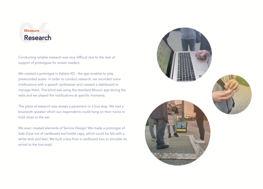
Figure 3.0 — Field testing on live Krakow sidewalks: Bluetooth speaker test rig & tactile Safe Zone prototype
We engineered a bespoke "Wizard of Oz" testing setup:
Synthesizer Dashboard
We recorded voice prompts via speech synthesis and triggered them dynamically from a hidden laptop dashboard as the respondent walked down the sidewalk with a wearable Bluetooth neck speaker.
Tactile Safe Zone Prototype
To test the physical Service Design layer, we constructed a 1:1 scale tactile paving prototype from corrugated cardboard and bottle caps that could be realistically detected with a white cane and boot soles.
We even built a cardboard mock bus to simulate vehicle arrival and door positioning directly at the bus stop edge!
Tactile service design meets digital telemetry.
The finalized Moovit accessibility system integrates four distinct components:
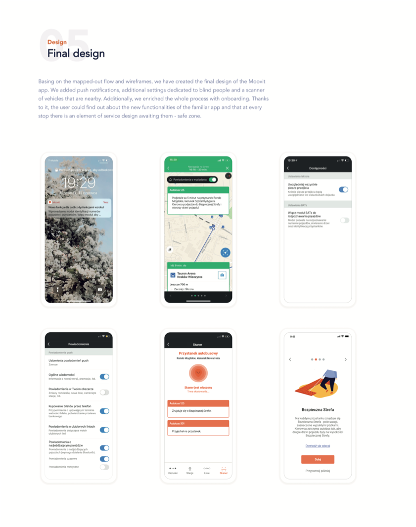
Figure 4.0 — High-fidelity UI flows: Lock screen notification, audio navigation, accessibility toggles, vehicle scanner & Safe Zone onboarding
1. Autonomous Vehicle Scanner (Skaner Pojazdów)
Utilizes Bluetooth Low Energy (BLE) beacon telemetry from incoming transit vehicles. The user points their phone toward the road; the app announces approaching vehicle lines (e.g., "Autobus 125 — arriving in 30 seconds at the Safe Zone").
2. Designated Safe Zone (Bezpieczna Strefa)
A physical platform element marked with raised tactile pavers. Transit drivers are instructed to stop second doors flush with the Safe Zone, eliminating the panic of locating open doors in crowds.
3. Conciseness-Calibrated Push Notifications
Based on our field conclusions, verbal notifications were shortened by 60%. Experienced commuters can toggle off redundant chatter while new commuters can tap "Learn More" for granular spatial context.
Accessibility is not a feature toggle. It is spatial empathy.
Designing for vulnerable user groups taught me that digital screens are rarely the complete answer. The real magic happens when software telemetry syncs gracefully with physical urban infrastructure—tactile paving, auditory acoustics, and driver operational guidelines.